
Back
Contact me
Client
Wyden
Industry
Educational
Year
2021
Wyden Educacional is an educational company with several branches across Brazil. This project aims to improve the acquisition journey by restructuring a wide range of websites into a single, cohesive structure. This approach should allow future students to easily navigate through course descriptions and make purchases based on their city and state, all through a new landing page focused on customer personas.
Impact
90%
reduction in URLs consolidating domains
4,25x
of navigation speed improved
E2E
navigation flow simplified
Context
With the advance in e-learning, many students have an opportunity to learn a new career at home. And many potential customers choose a college and course based on this benefit.
One of my challenges on Wyden was to develop a way to persuade these customers to enroll in a course, shortening the user journey.
Problem
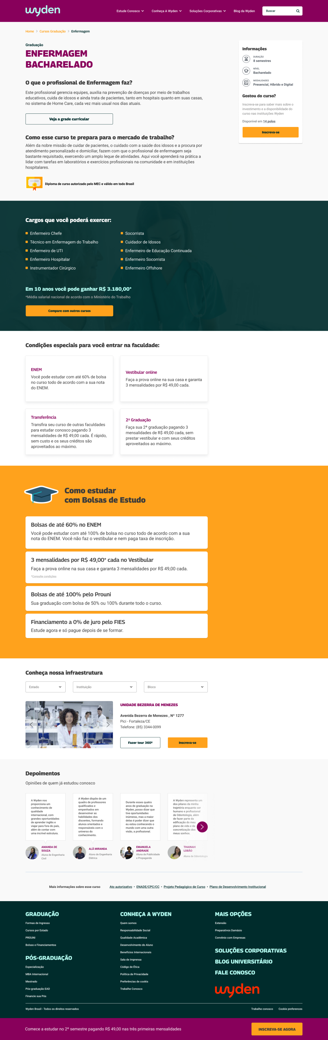
The Wyden website had a complex information hierarchy. If a student was looking for a specific course, they had to choose a state, institution, and department.
According to the selected institution, the user would be led to another landing page. If the institution was located in several cities, it would have a website for each location.
This hierarchy has caused maintenance issues over the years. When I started this project, there were almost 800 URLs. Most of these URLs were related to duplicated information from local institutions.
Also, the website had many inconsistent pages due to branding issues. Some pages had an old logo with a blue-and-white visual idenditity, while others had the new branding.
Our goal
Simplify the user journey through the main landing page, reduce the number of URLs by institution, and boost the percentage of course subscriptions and purchases.
Methodology
As a methodology, I adopted the Double Diamond method, a framework that helps the product and design team to understand the problem core and deliver a user centric solution, with proper validations.
Research
To learn more about the institution, we looked at an internal database that had information from a previous survey. This survey revealed how students choose both an institution and a specific course for enrollment. The information we gathered was very helpful in designing our new website.
The following table compares the responses from students at Wyden and Estacio.
Relevant insights
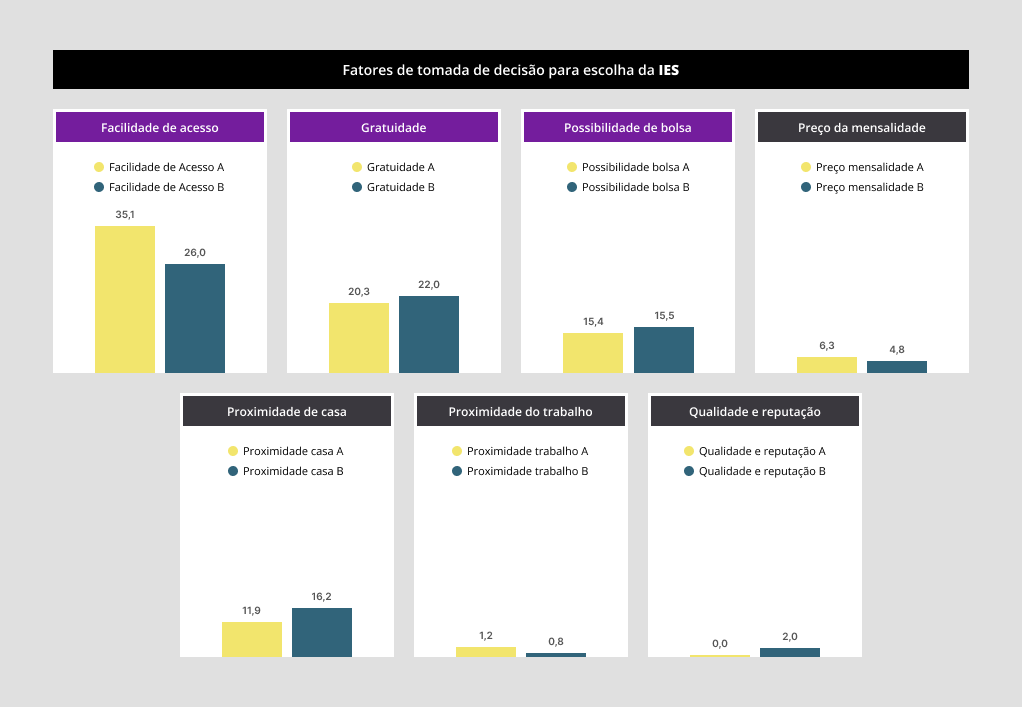
Which were the criteria to study at Wyden?
- Easy access (35,1%)
- Free admission (20,3%)
- Scholarship (15,4%)
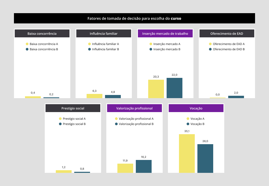
Which were the criteria to enroll in a course at Wyden?
- Vocation (35,1%)
- Facility to find a job (20,3%)
- Professional valorization (11,9%)
Hypothesis
The survey results helped us understand what future students are looking for, and this will help us decide how to organize the information on our website. If students can find the information they need more easily, they'll be more likely to enroll in a course.
Benchmarking
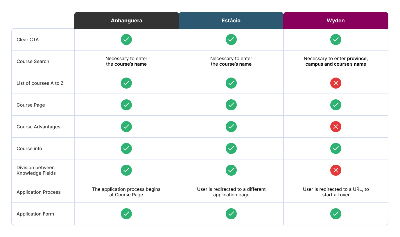
One of the best ways to learn the best practices is by watching what our competitors are doing. We chose two main educational companies and compared their interaction practices.
The selected competitors were: Anhanguera and Estacio.
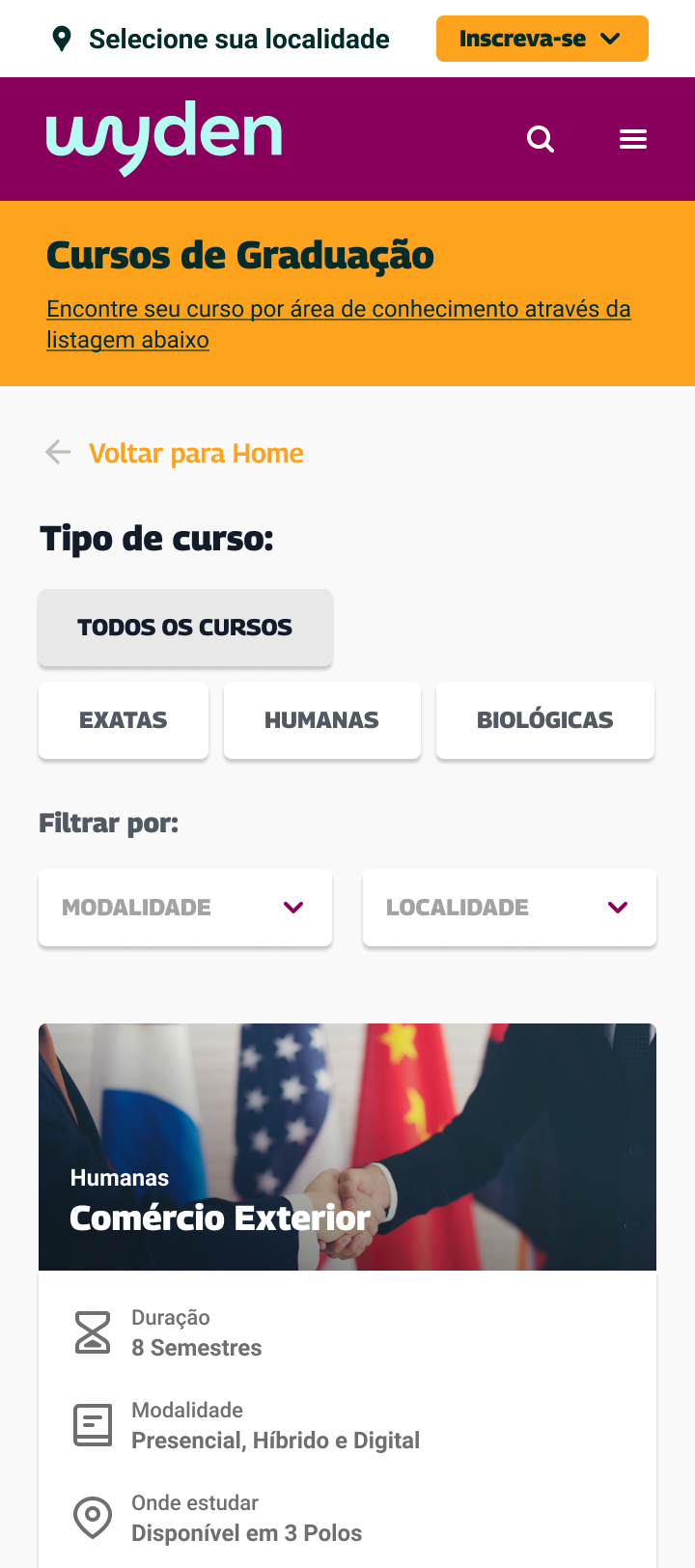
After comparing all information, we tracked some problems on Wyden's website:
- The search component asks for more information than necessary, like state, city, campus, and course.
- The courses aren't listed in order, which makes it hard to scan the page.
- There's no clear reason why the student should sign up for the course.
- The application process is complicated. Users must enter information from the previous page, such as their state, city, campus, and course name.
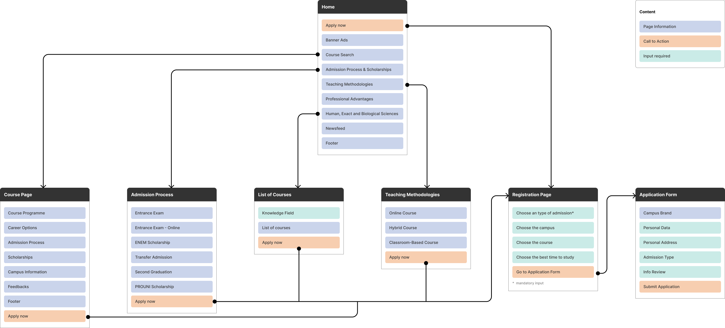
Hierarchy information
Then we decided to redefine the website hierarchy. Our goal was to provide a better experience for the admission process. So, we had to manage several ways to lead the user to the Registration Page/Application Form.
Solution
Prioritizing important and key information in the landing page will help Wyden increase the number of interested students. Also, eliminating 90% of URLs would strenght the institution identity, decrease the number of manteinances and money spent on URLs that weren't converting into subscriptions.
Check the Figma file

password: yohana25


Back
Contact me
Client
Wyden
Industry
Educational
Year
2021
Wyden Educacional is an educational company with several branches across Brazil. This project aims to improve the acquisition journey by restructuring a wide range of websites into a single, cohesive structure. This approach should allow future students to easily navigate through course descriptions and make purchases based on their city and state, all through a new landing page focused on customer personas.
Impact
90%
reduction in URLs, consolidating domains
4,25x
of navigation speed improved
E2E
navigation flow simplified
Context
With the advance in e-learning, many students have an opportunity to learn a new career at home. And many potential customers choose a college and course based on this benefit.
One of my challenges on Wyden was to develop a way to persuade these customers to enroll in a course, shortening the user journey.
Problem
The Wyden website had a complex information hierarchy. If a student was looking for a specific course, they had to choose a state, institution, and department.
According to the selected institution, the user would be led to another landing page. If the institution was located in several cities, it would have a website for each location.
This hierarchy has caused maintenance issues over the years. When I started this project, there were almost 800 URLs. Most of these URLs were related to duplicated information from local institutions.
Also, the website had many inconsistent pages due to branding issues. Some pages had an old logo with a blue-and-white visual idenditity, while others had the new branding.
Our goal
Simplify the user journey through the main landing page, reduce the number of URLs by institution, and boost the percentage of course subscriptions and purchases.
Methodology
As a methodology, I adopted the Double Diamond method, a framework that helps the product and design team to understand the problem core and deliver a user centric solution, with proper validations.
Research
To learn more about the institution, we looked at an internal database that had information from a previous survey. This survey revealed how students choose both an institution and a specific course for enrollment. The information we gathered was very helpful in designing our new website.
The following table compares the responses from students at Wyden and Estacio.
Relevant insights
Which were the criteria to study at Wyden?
- Easy access (35,1%)
- Free admission (20,3%)
- Scholarship (15,4%)
Which were the criteria to enroll in a course at Wyden?
- Vocation (35,1%)
- Facility to find a job (20,3%)
- Professional valorization (11,9%)
Hypothesis
The survey results helped us understand what future students are looking for, and this will help us decide how to organize the information on our website. If students can find the information they need more easily, they'll be more likely to enroll in a course.
Benchmarking
One of the best ways to learn the best practices is by watching what our competitors are doing. We chose two main educational companies and compared their interaction practices.
The selected competitors were: Anhanguera and Estacio.
After comparing all information, we tracked some problems on Wyden's website:
- The search component asks for more information than necessary, like state, city, campus, and course.
- The courses aren't listed in order, which makes it hard to scan the page.
- There's no clear reason why the student should sign up for the course.
- The application process is complicated. Users must enter information from the previous page, such as their state, city, campus, and course name.
Hierarchy information
Then we decided to redefine the website hierarchy. Our goal was to provide a better experience for the admission process. So, we had to manage several ways to lead the user to the Registration Page/Application Form.
Solution
Prioritizing important and key information in the landing page will help Wyden increase the number of interested students. Also, eliminating 90% of URLs would strenght the institution identity, decrease the number of manteinances and money spent on URLs that weren't converting into subscriptions.
Check the Figma file
password: yohana25
Back
Contact me
Client
Wyden
Industry
Educational
Year
2021
Wyden Educacional is an educational company with several branches across Brazil. This project aims to improve the acquisition journey by restructuring a wide range of websites into a single, cohesive structure. This approach should allow future students to easily navigate through course descriptions and make purchases based on their city and state, all through a new landing page focused on customer personas.
Impact
90%
reduction in URLs consolidating domains
4,25x
of navigation speed improved
E2E
navigation flow simplified
Context
With the advance in e-learning, many students have an opportunity to learn a new career at home. And many potential customers choose a college and course based on this benefit.
One of my challenges on Wyden was to develop a way to persuade these customers to enroll in a course, shortening the user journey.
Problem
The Wyden website had a complex information hierarchy. If a student was looking for a specific course, they had to choose a state, institution, and department.
According to the selected institution, the user would be led to another landing page. If the institution was located in several cities, it would have a website for each location.
This hierarchy has caused maintenance issues over the years. When I started this project, there were almost 800 URLs. Most of these URLs were related to duplicated information from local institutions.
Also, the website had many inconsistent pages due to branding issues. Some pages had an old logo with a blue-and-white visual idenditity, while others had the new branding.
Our goal
Simplify the user journey through the main landing page, reduce the number of URLs by institution, and boost the percentage of course subscriptions and purchases.
Methodology
As a methodology, I adopted the Double Diamond method, a framework that helps the product and design team to understand the problem core and deliver a user centric solution, with proper validations.
Research
To learn more about the institution, we looked at an internal database that had information from a previous survey. This survey revealed how students choose both an institution and a specific course for enrollment. The information we gathered was very helpful in designing our new website.
The following table compares the responses from students at Wyden and Estacio.
Relevant insights
Which were the criteria to study at Wyden?
- Easy access (35,1%)
- Free admission (20,3%)
- Scholarship (15,4%)
Which were the criteria to enroll in a course at Wyden?
- Vocation (35,1%)
- Facility to find a job (20,3%)
- Professional valorization (11,9%)
Hypothesis
The survey results helped us understand what future students are looking for, and this will help us decide how to organize the information on our website. If students can find the information they need more easily, they'll be more likely to enroll in a course.
Benchmarking
One of the best ways to learn the best practices is by watching what our competitors are doing. We chose two main educational companies and compared their interaction practices.
The selected competitors were: Anhanguera and Estacio.
After comparing all information, we tracked some problems on Wyden's website:
- The search component asks for more information than necessary, like state, city, campus, and course.
- The courses aren't listed in order, which makes it hard to scan the page.
- There's no clear reason why the student should sign up for the course.
- The application process is complicated. Users must enter information from the previous page, such as their state, city, campus, and course name.
Hierarchy information
Then we decided to redefine the website hierarchy. Our goal was to provide a better experience for the admission process. So, we had to manage several ways to lead the user to the Registration Page/Application Form.
Solution
Prioritizing important and key information in the landing page will help Wyden increase the number of interested students. Also, eliminating 90% of URLs would strenght the institution identity, decrease the number of manteinances and money spent on URLs that weren't converting into subscriptions.
Check the Figma file
password: yohana25