
Back
Contact me
Client
Casa Magalhães
Industry
Retail
Year
2018 - 2020
VarejoMini is a white-label SaaS and cloud system designed for small and mid-sized stores to streamline sales management and boost results. It helps entrepreneurs monitor sales revenue, identify top-selling products, track stock movement, and maintain awareness of their business's financial health.
Impact
+50
small and medium business served by the solution
11
features developed, such as Product Catalog, Inventory and Purchases
+200
screens designed
Context
VarejoMini was created to be a simplified version of VarejoFácil, a legacy software from Casa Magalhães designed for the restaurant sector. However, during the project's reevaluation, some important strategic questions were discussed:
What is the true value proposition of VarejoMini? How can we differentiate it from an existing product? And how can we ensure its scalability without making it redundant?
Problem
- Strategically, VarejoMini was on track to become merely a lean copy of VarejoFácil, lacking a clear value proposition. There was no differentiation or long-term scalability plan in place.
- Usability and Interface: The ERP was not responsive, had grids and graphs that were hard to read, was not ready for white-labeling, and featured inconsistent interactions.
Goal
- Realign the strategic purpose of the product to ensure it provides a truly differentiated solution for small businesses, extending beyond just the restaurant sector.
- Restructure the interface to make it responsive, more intuitive, scalable, and visually consistent.
- Establish a solid product foundation for future developments, avoiding the path already taken by another system in the company.

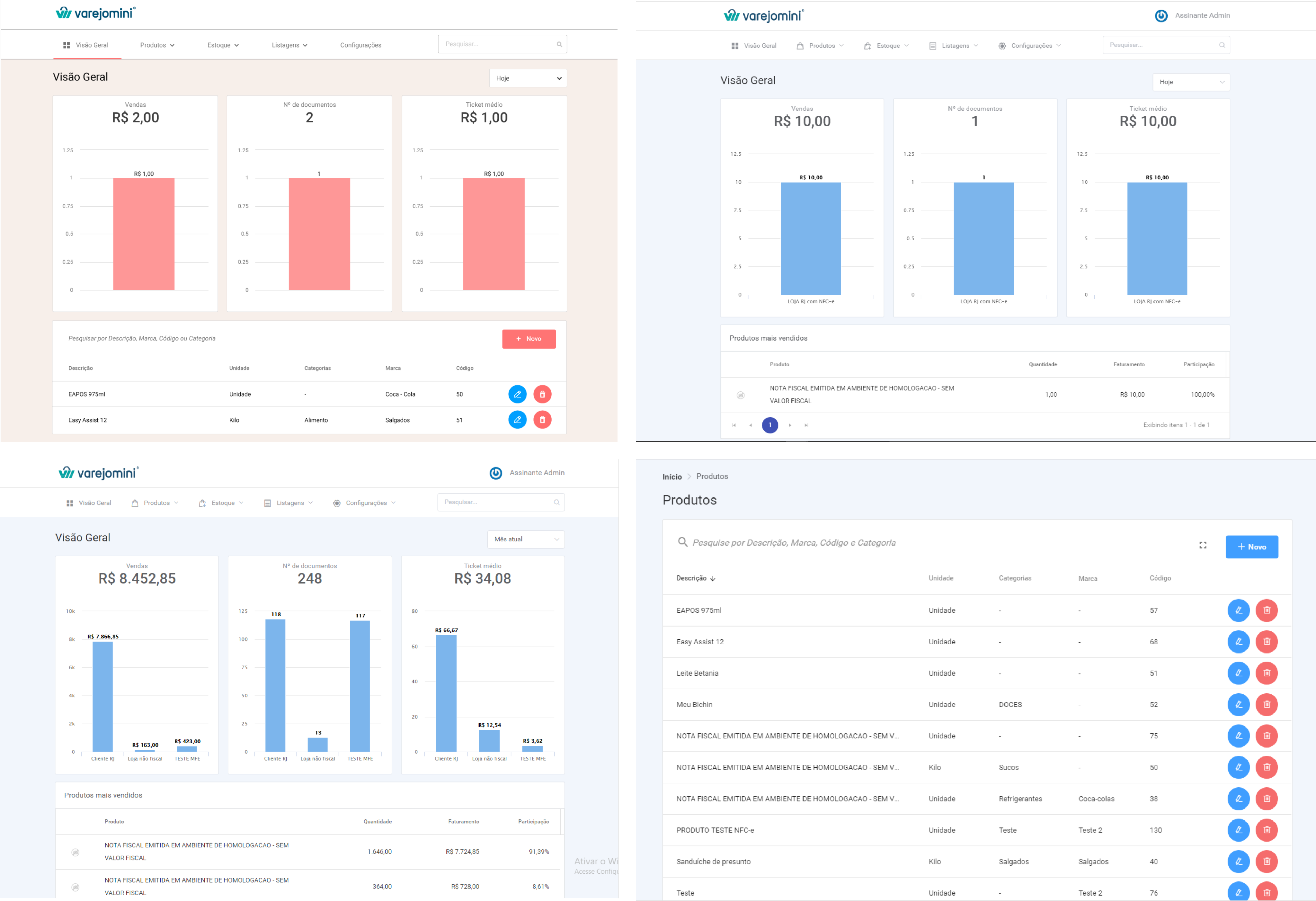
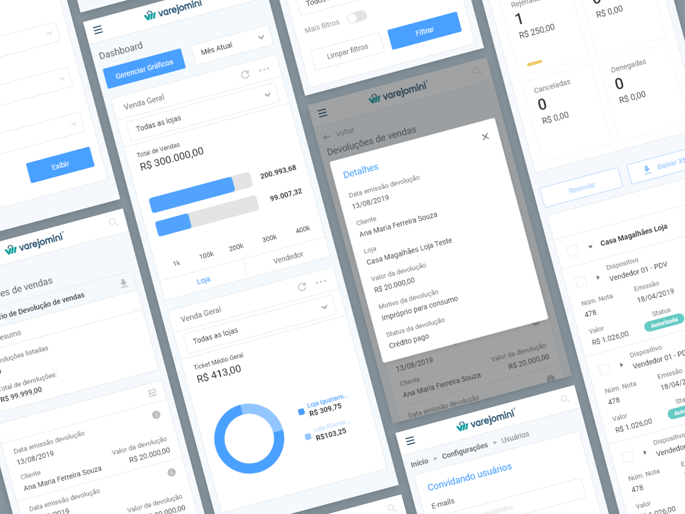
Previous screens
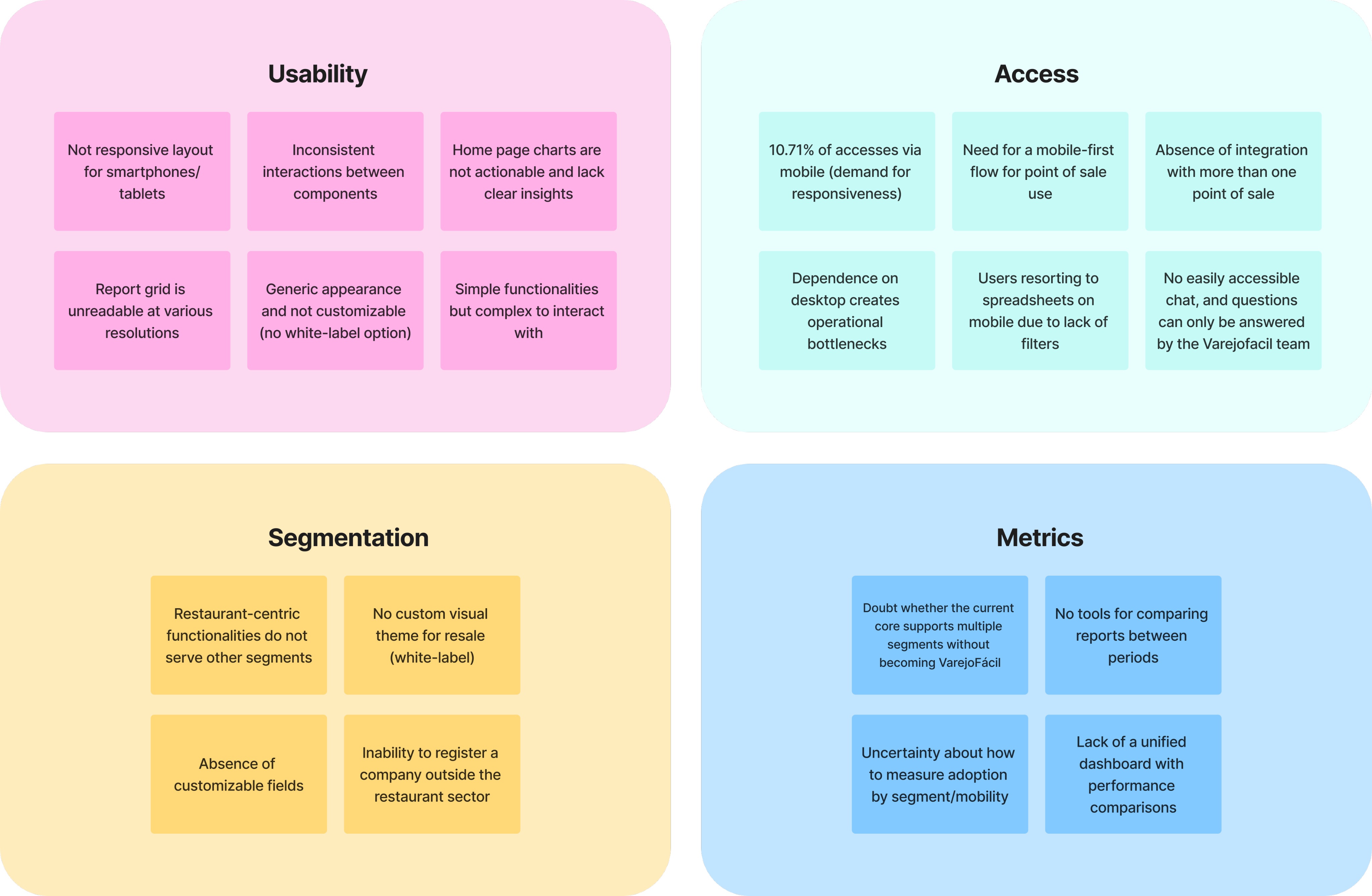
Research
To determine the new strategic positioning of the product, we held meetings with the PO and stakeholders, conducted a comparative analysis with VarejoFácil, and evaluated data from Google Analytics, which was implemented on the platform. Additionally, we gathered informal customer feedback and analyzed support tickets, providing strong support for the new strategy. Below, we compiled the information into an Affinity Map categorized by topic:
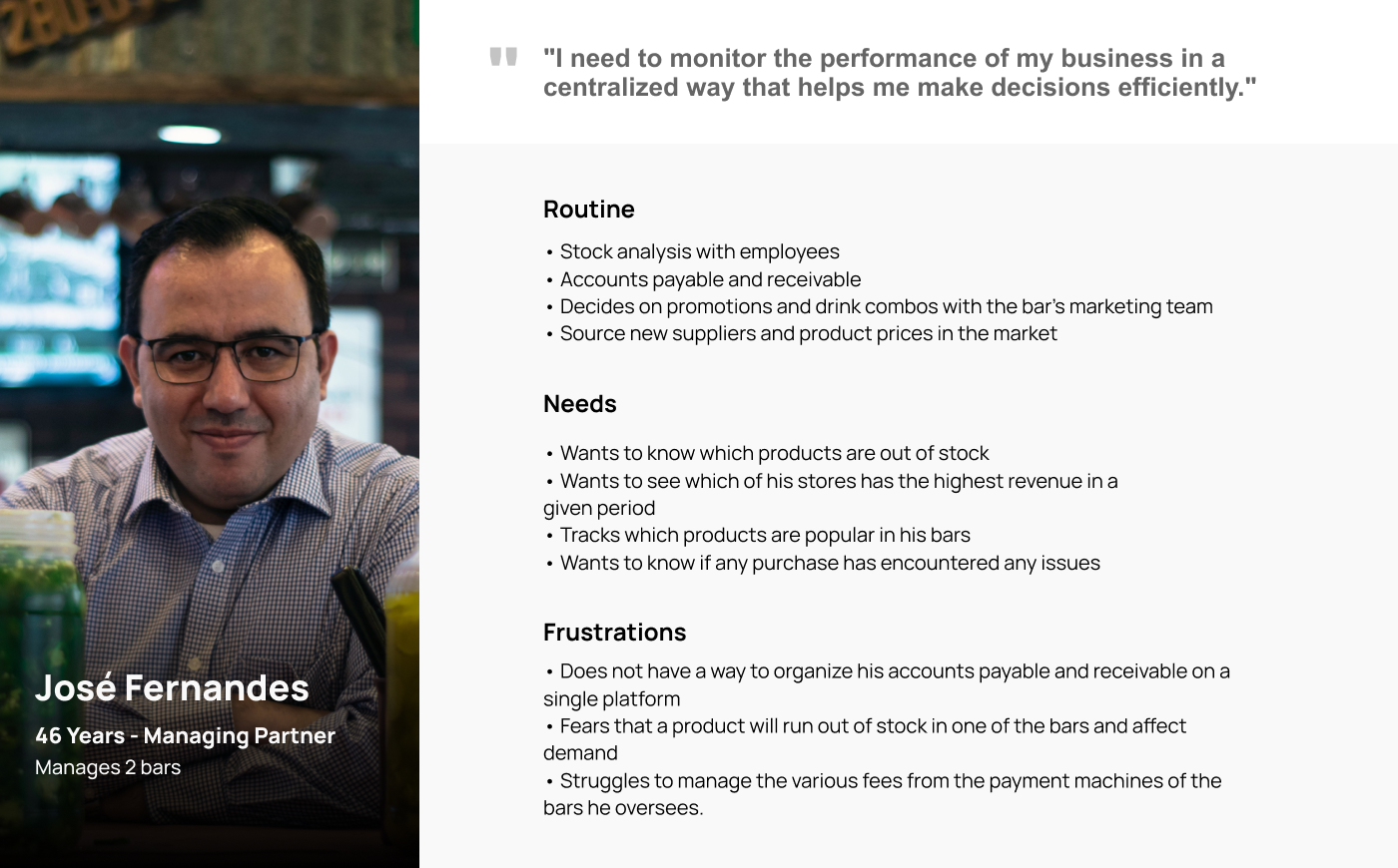
Persona
The persona was developed to represent a typical Varejomini user, following a discussion of requirements and insights gained from our affinity mapping. This approach allows us to better understand user needs and challenges, guiding how we structure the information and how our product should serve this type of user.
User stories
With the new business goals and the actual needs of the customers in mind, VarejoMini began to receive new features focused on three main user stories:
"I would like to organize my inventory."

"I would like to track my revenue."
"I would like to view my reports."
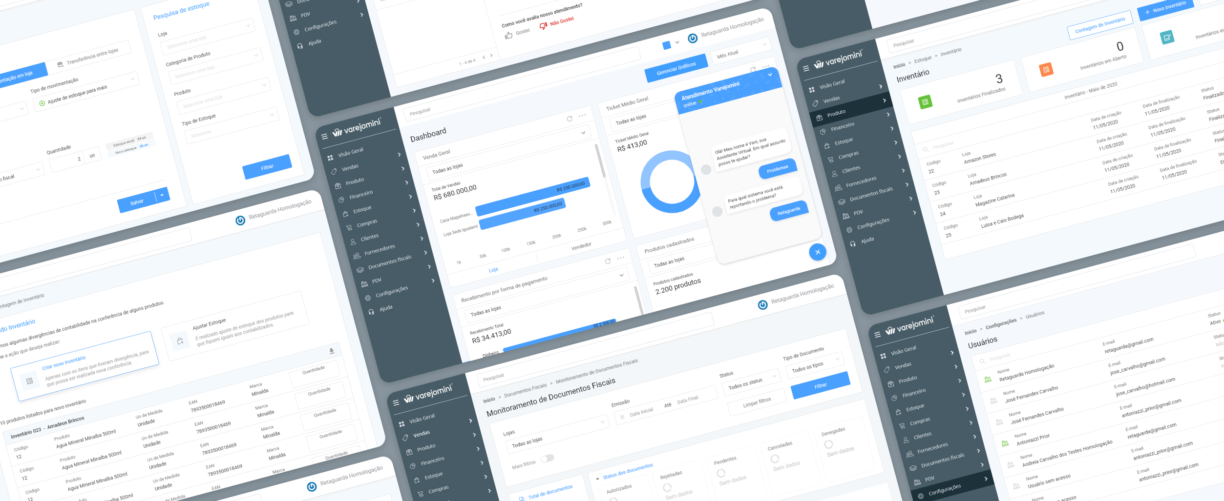
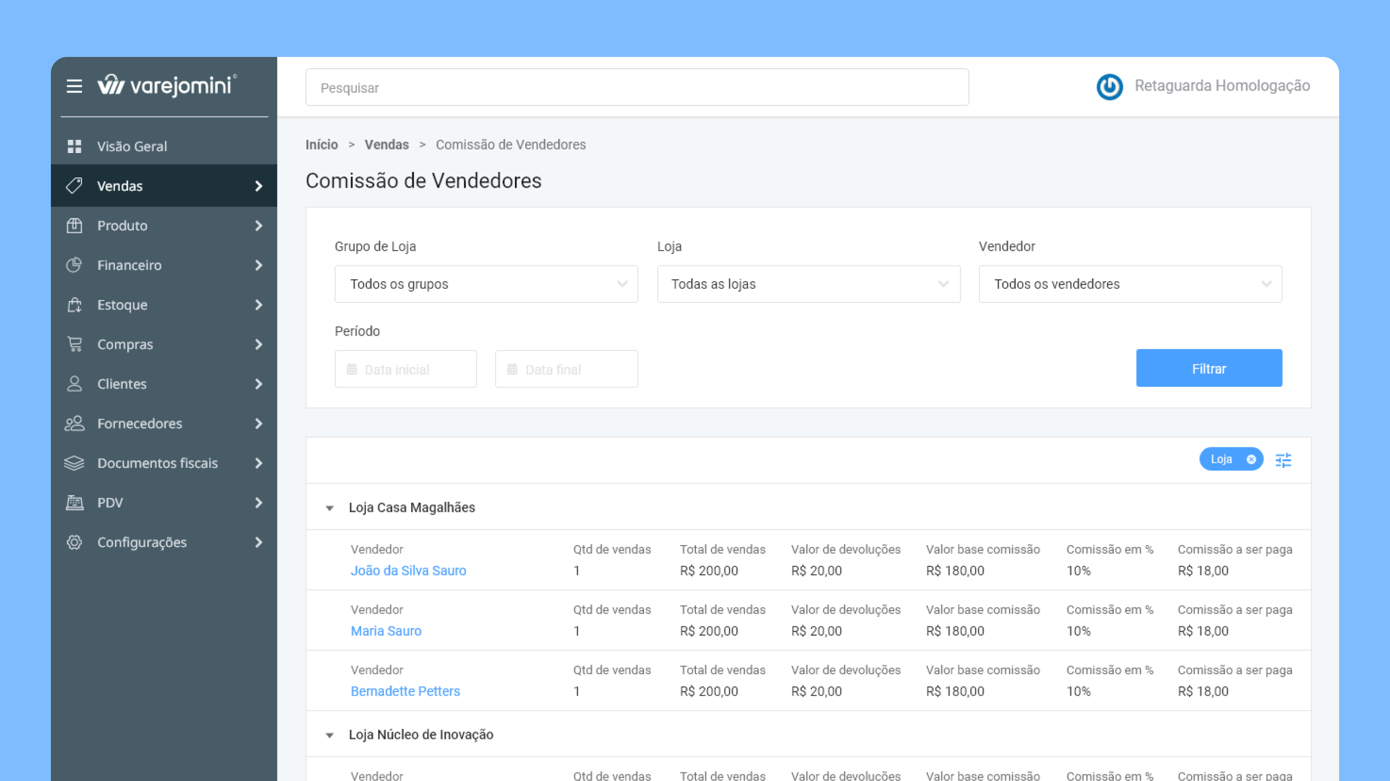
Solution
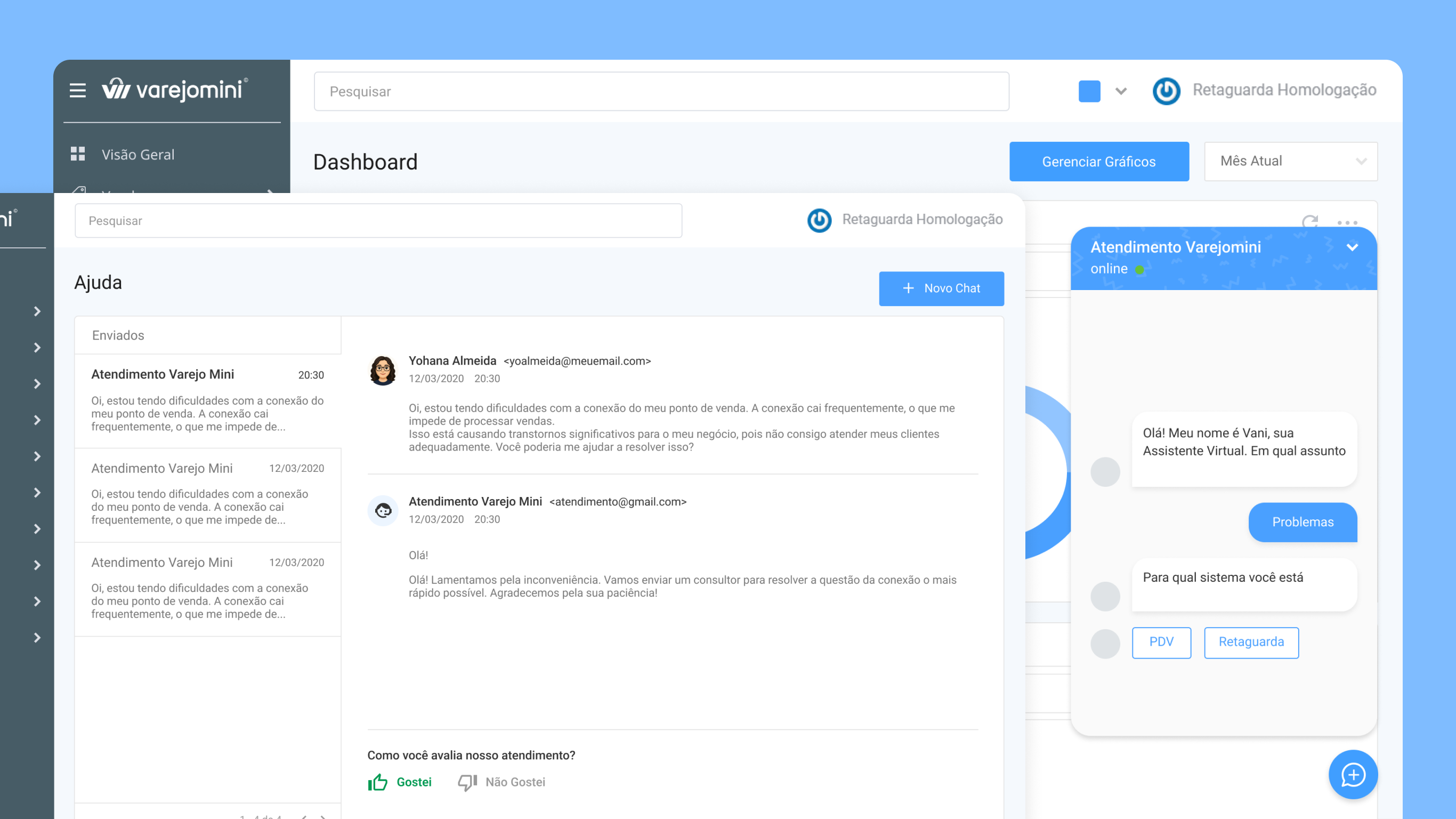
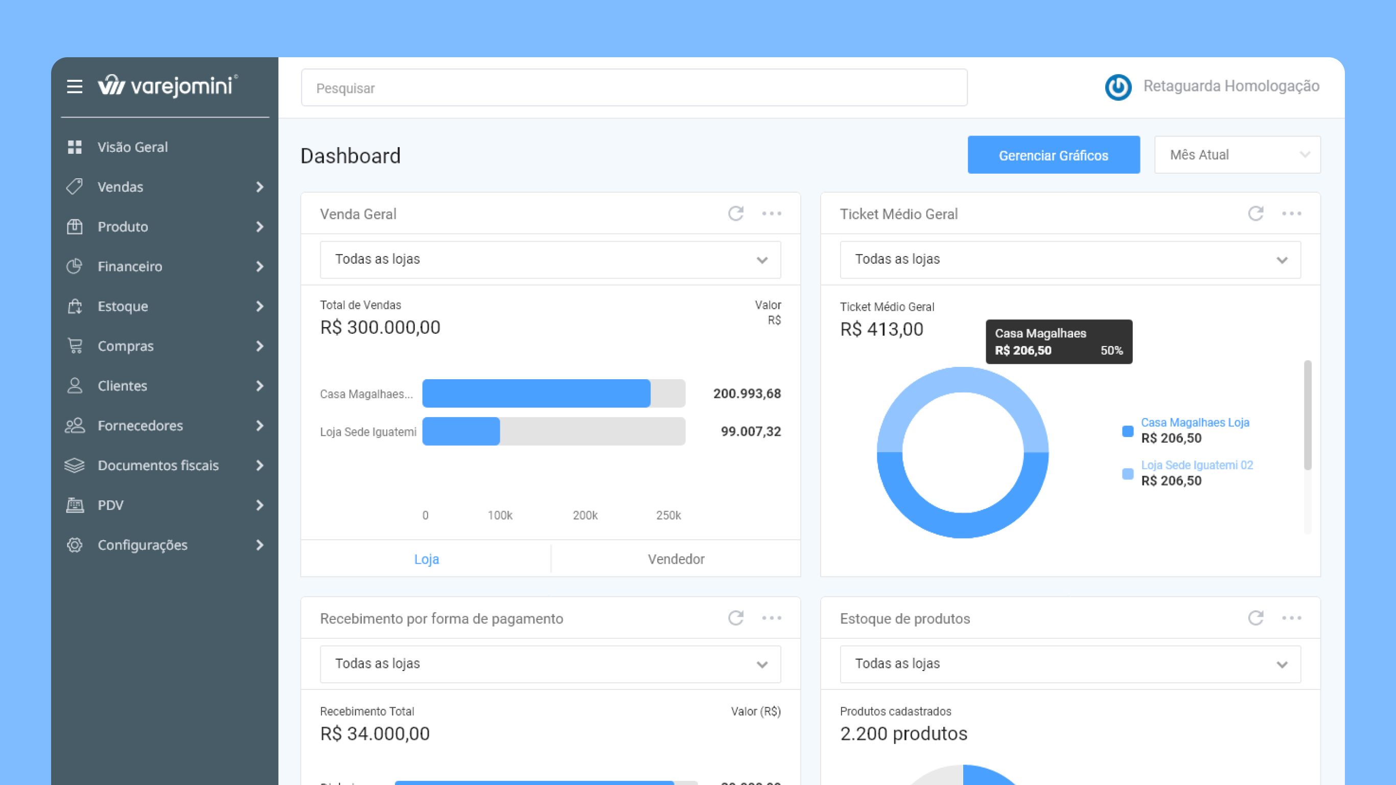
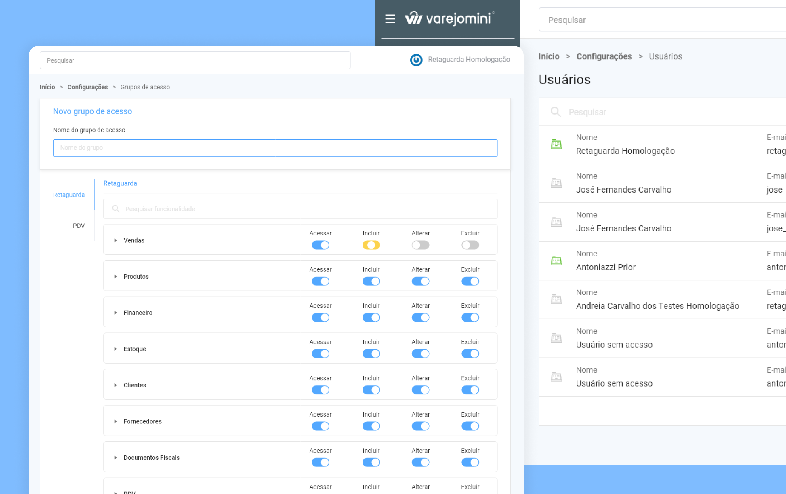
In this product, over 200 screens were developed, highlighting the key improvements:
- More focused charts that provide personalized information per store;
- A chatbot to assist users with their questions;
- A responsive environment for various resolutions;
- Customizable reports where users can hide and reveal columns;
- Use of tags and visual elements to reduce cognitive load during reading.
For Varejomini, we developed features to tackle various segments of a business, such as:
- Sales, Product Catalog, Financial Management, Inventory, Purchases, Tax Documents, POS, and Settings.
Continuous delivery
Initially, we didn't finalize a sitemap for this project due to the constant and iterative pace of requirement definitions and prototype deliveries. However, the product team had a roadmap of features planned for the final product scope. The diagram below illustrates how we embraced the concept of continuous improvements and deliveries in our project.
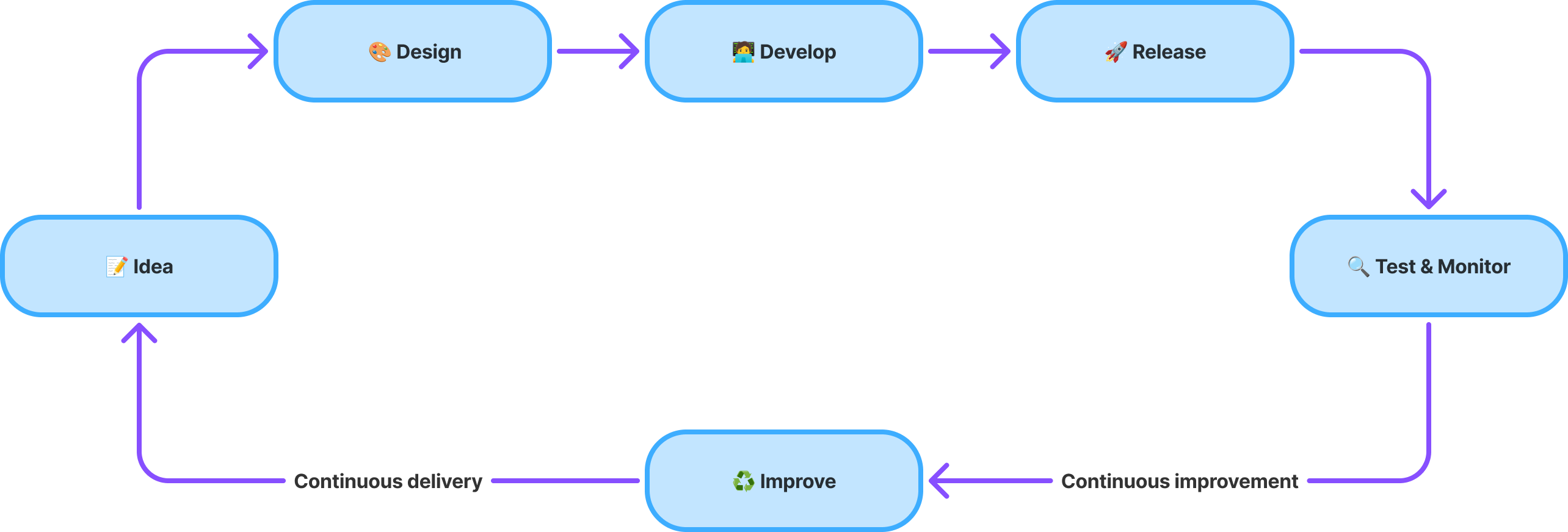
With each delivery, a feature was developed and validated with stakeholders, allowing us to gather feedback for adjustments until the final implementation on the platform.
Takeaways
With every improvement developed and implemented, my team and I monitored user behavior through Smartlook, as well as adoption and usage metrics via Google Analytics. These tools provided insights into which components we could continue using in other screens and highlighted errors we made that could be improved, ensuring a better user experience on the platform.
Also, I managed to build a simple design system for this application. It would help me and the engineering team to follow startands and best practices for mobile-first design and white-label adaptations.
Check the Figma file


Back
Contact me
Client
Casa Magalhães
Industry
Retail
Year
2018 - 2020
VarejoMini is a white-label SaaS and cloud system designed for small and mid-sized stores to streamline sales management and boost results. It helps entrepreneurs monitor sales revenue, identify top-selling products, track stock movement, and maintain awareness of their business's financial health.
Impact
+50
small and medium business served by the solution
11
features developed, such as Product Catalog, Inventory and Purchases
+200
screens designed
Context
VarejoMini was created to be a simplified version of VarejoFácil, a legacy software from Casa Magalhães designed for the restaurant sector. However, during the project's reevaluation, some important strategic questions were discussed:
What is the true value proposition of VarejoMini? How can we differentiate it from an existing product? And how can we ensure its scalability without making it redundant?
Problem
- Strategically, VarejoMini was on track to become merely a lean copy of VarejoFácil, lacking a clear value proposition. There was no differentiation or long-term scalability plan in place.
- Usability and Interface: The ERP was not responsive, had grids and graphs that were hard to read, was not ready for white-labeling, and featured inconsistent interactions.
Goal
- Realign the strategic purpose of the product to ensure it provides a truly differentiated solution for small businesses, extending beyond just the restaurant sector.
- Restructure the interface to make it responsive, more intuitive, scalable, and visually consistent.
- Establish a solid product foundation for future developments, avoiding the path already taken by another system in the company.
Previous screens
Research
To determine the new strategic positioning of the product, we held meetings with the PO and stakeholders, conducted a comparative analysis with VarejoFácil, and evaluated data from Google Analytics, which was implemented on the platform. Additionally, we gathered informal customer feedback and analyzed support tickets, providing strong support for the new strategy. Below, we compiled the information into an Affinity Map categorized by topic:
Persona
The persona was developed to represent a typical Varejomini user, following a discussion of requirements and insights gained from our affinity mapping. This approach allows us to better understand user needs and challenges, guiding how we structure the information and how our product should serve this type of user.
User stories
With the new business goals and the actual needs of the customers in mind, VarejoMini began to receive new features focused on three main user stories:
"I would like to organize my inventory."

"I would like to track my revenue."
"I would like to view my reports."
Solution
In this product, over 200 screens were developed, highlighting the key improvements:
- More focused charts that provide personalized information per store;
- A chatbot to assist users with their questions;
- A responsive environment for various resolutions;
- Customizable reports where users can hide and reveal columns;
- Use of tags and visual elements to reduce cognitive load during reading.
For Varejomini, we developed features to tackle various segments of a business, such as:
- Sales, Product Catalog, Financial Management, Inventory, Purchases, Tax Documents, POS, and Settings.
Continuous delivery
Initially, we didn't finalize a sitemap for this project due to the constant and iterative pace of requirement definitions and prototype deliveries. However, the product team had a roadmap of features planned for the final product scope. The diagram below illustrates how we embraced the concept of continuous improvements and deliveries in our project.
With each delivery, a feature was developed and validated with stakeholders, allowing us to gather feedback for adjustments until the final implementation on the platform.
Takeaways
With every improvement developed and implemented, my team and I monitored user behavior through Smartlook, as well as adoption and usage metrics via Google Analytics. These tools provided insights into which components we could continue using in other screens and highlighted errors we made that could be improved, ensuring a better user experience on the platform.
Also, I managed to build a simple design system for this application. It would help me and the engineering team to follow startands and best practices for mobile-first design and white-label adaptations.
Check the Figma file
Back
Contact me
Client
Casa Magalhães
Industry
Retail
Year
2018 - 2020
VarejoMini is a white-label SaaS and cloud system designed for small and mid-sized stores to streamline sales management and boost results. It helps entrepreneurs monitor sales revenue, identify top-selling products, track stock movement, and maintain awareness of their business's financial health.
Impact
+50
small and medium business served by the solution
11
features developed, such as Product Catalog, Inventory and Purchases
+200
screens designed
Context
VarejoMini was created to be a simplified version of VarejoFácil, a legacy software from Casa Magalhães designed for the restaurant sector. However, during the project's reevaluation, some important strategic questions were discussed:
What is the true value proposition of VarejoMini? How can we differentiate it from an existing product? And how can we ensure its scalability without making it redundant?
Problem
- Strategically, VarejoMini was on track to become merely a lean copy of VarejoFácil, lacking a clear value proposition. There was no differentiation or long-term scalability plan in place.
- Usability and Interface: The ERP was not responsive, had grids and graphs that were hard to read, was not ready for white-labeling, and featured inconsistent interactions.
Goal
- Realign the strategic purpose of the product to ensure it provides a truly differentiated solution for small businesses, extending beyond just the restaurant sector.
- Restructure the interface to make it responsive, more intuitive, scalable, and visually consistent.
- Establish a solid product foundation for future developments, avoiding the path already taken by another system in the company.
Previous screens
Research
To determine the new strategic positioning of the product, we held meetings with the PO and stakeholders, conducted a comparative analysis with VarejoFácil, and evaluated data from Google Analytics, which was implemented on the platform. Additionally, we gathered informal customer feedback and analyzed support tickets, providing strong support for the new strategy. Below, we compiled the information into an Affinity Map categorized by topic:
Persona
The persona was developed to represent a typical Varejomini user, following a discussion of requirements and insights gained from our affinity mapping. This approach allows us to better understand user needs and challenges, guiding how we structure the information and how our product should serve this type of user.
User stories
With the new business goals and the actual needs of the customers in mind, VarejoMini began to receive new features focused on three main user stories:
"I would like to organize my inventory."

"I would like to track my revenue."
"I would like to view my reports."
Solution
In this product, over 200 screens were developed, highlighting the key improvements:
- More focused charts that provide personalized information per store;
- A chatbot to assist users with their questions;
- A responsive environment for various resolutions;
- Customizable reports where users can hide and reveal columns;
- Use of tags and visual elements to reduce cognitive load during reading.
For Varejomini, we developed features to tackle various segments of a business, such as:
- Sales, Product Catalog, Financial Management, Inventory, Purchases, Tax Documents, POS, and Settings.
Continuous delivery
Initially, we didn't finalize a sitemap for this project due to the constant and iterative pace of requirement definitions and prototype deliveries. However, the product team had a roadmap of features planned for the final product scope. The diagram below illustrates how we embraced the concept of continuous improvements and deliveries in our project.
With each delivery, a feature was developed and validated with stakeholders, allowing us to gather feedback for adjustments until the final implementation on the platform.
Takeaways
With every improvement developed and implemented, my team and I monitored user behavior through Smartlook, as well as adoption and usage metrics via Google Analytics. These tools provided insights into which components we could continue using in other screens and highlighted errors we made that could be improved, ensuring a better user experience on the platform.
Also, I managed to build a simple design system for this application. It would help me and the engineering team to follow startands and best practices for mobile-first design and white-label adaptations.
Check Varejo Mini DS