
Back
Contact me
Client
Tembici
Industry
Mobility
Year
2022
Tembici is a bike sharing platform, which allows users to avoid traffic of big cities, practice activities and enjoy an ecofriendly transport . As the product designer responsible for the project, I partnered with Tembici to understand the gaps through the Purchase flow, and designed a new solution based in interviews and usability tests.
Context
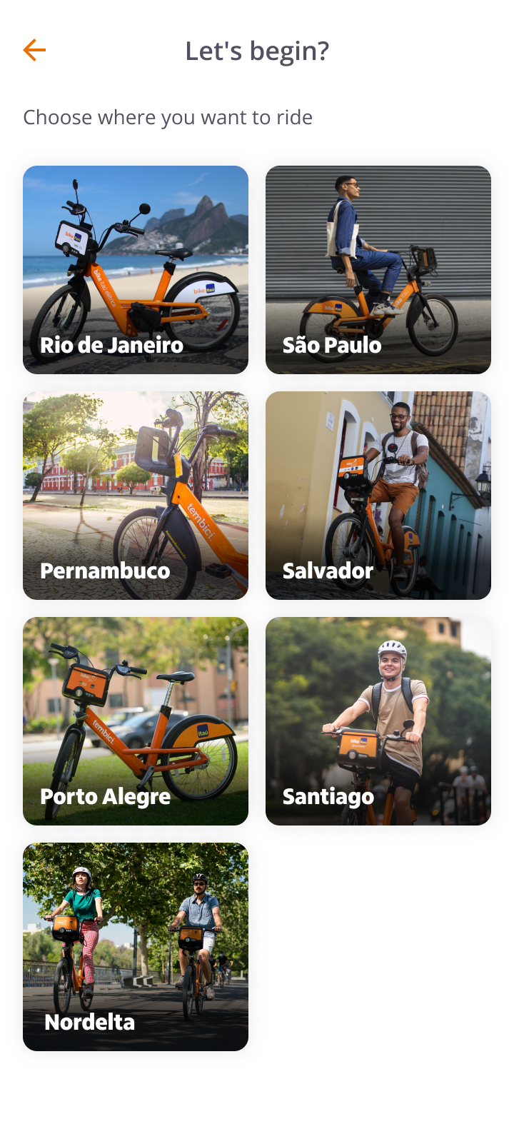
Tembici is a micro-mobility startup, that offers the opportunity to rent bikes with different purchase plans. Now, Tembici operates in 14 cities. That means they have a lot of different ride passes for different locations, because of local contracts. These deals bring some kind of complexity to the plans.
We observed that the number of tickets related to Ride Pass Information on the HelpCenter increased a lot, leading to low NPS rates.
Problem
We observed that we had 3 main problems to solve:
- Customers get frustrated and ask for a refund on Help Center;
- Difficulty to understand how the ride pass works;
- Not enough information about how fees are charged;
Our goal
Redesign the purchase process and improve the presentation of ride passes on checkout.
Methodology
As a methodology, I adopted the Double Diamond method, a framework that helps the product and design team to understand the problem core and deliver a user centric solution, with proper validations.
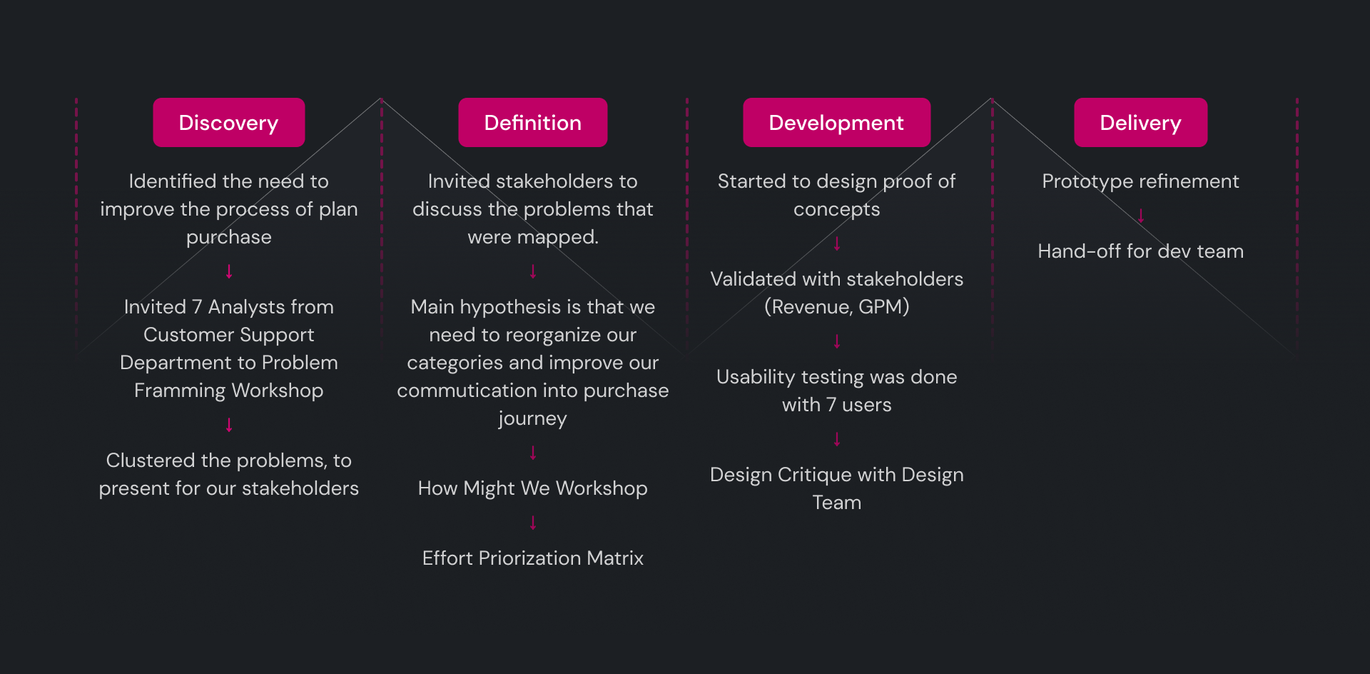
Research
We invited 7 analysts from Customer Support Department to join a workshop discovery. The analysts had full context of our user needs, so, their participation in the problem framming would be a starting point in the discovery process.
In the Problem Framming workshop, we discussed the following topics:
- User pains about ride passes;
- Usage fee and other charges;
- Main doubts about plan’s information;
- Reports about categories.
Relevant insights
- Customers don't know if a plan has auto renewal or not
- Users don't understand why they are charged, because the fee information is not accessible on app.
- Customers have lack of understanding about rules of ride passes because this information is not accessible
- Customers get frustrated because they are charged if they don’t return the bike to the station.
- Some ride passes were duplicated through categories, so we need to reorganize that information.
- Sometimes users aren’t able to unlock a bike and are charged for that.
How Might We
In this workshop, we could discuss some opportunities for this purchase journey challenge.
Highlight points of discussion:
- How might we make ease the comparison between ride passes?
- How might we make rules clearer for our users?
- How might we show in an effective way the reason we are charging the user?
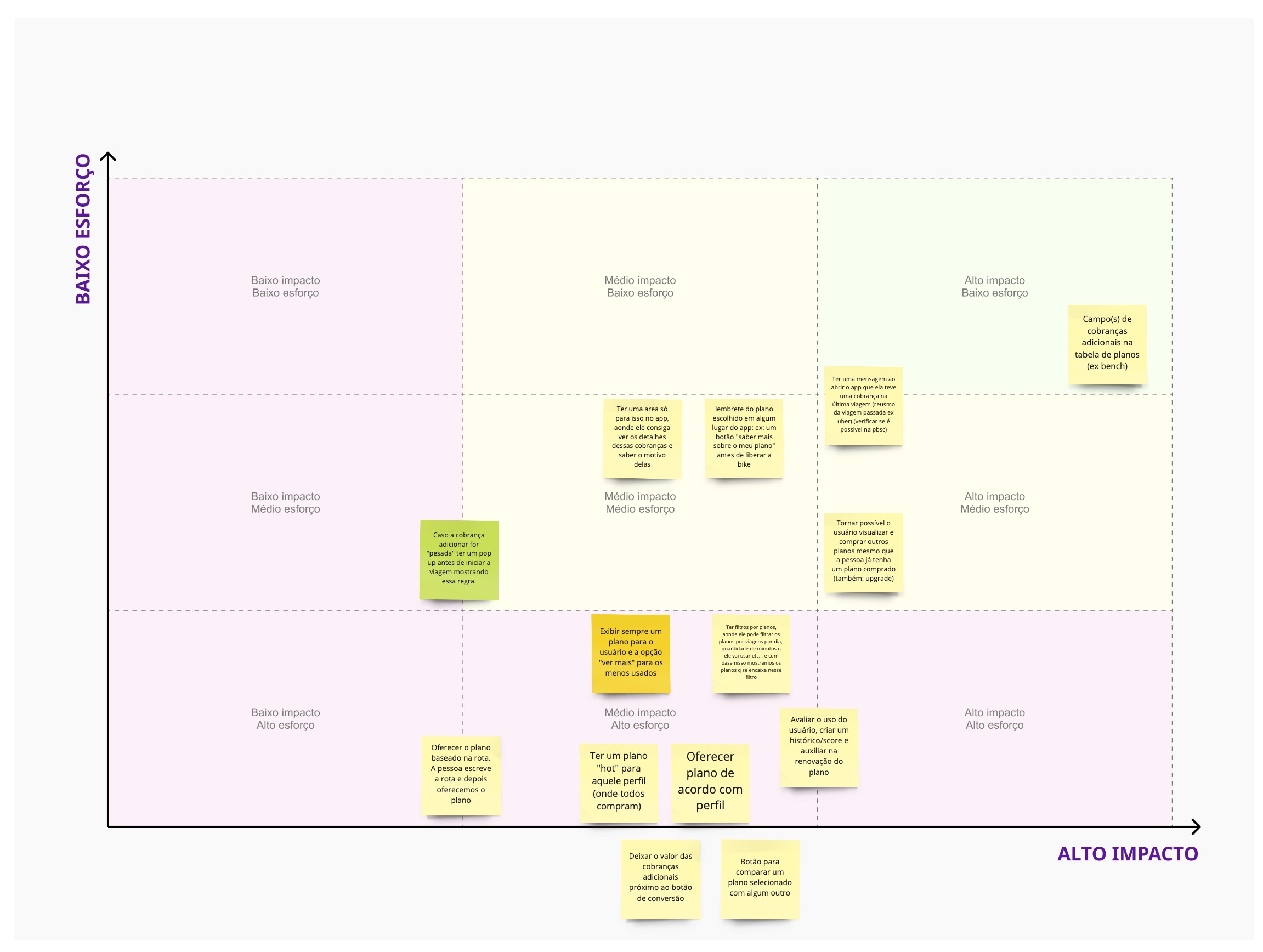
Effort Priorization Matrix
Along with the dev team, we categorized which initiatives (discussed in the HMW workshop) would bring us quick wins. Based on this matrix, we prioritized in the sprint the suggestions next to the green board.
Hypothesis
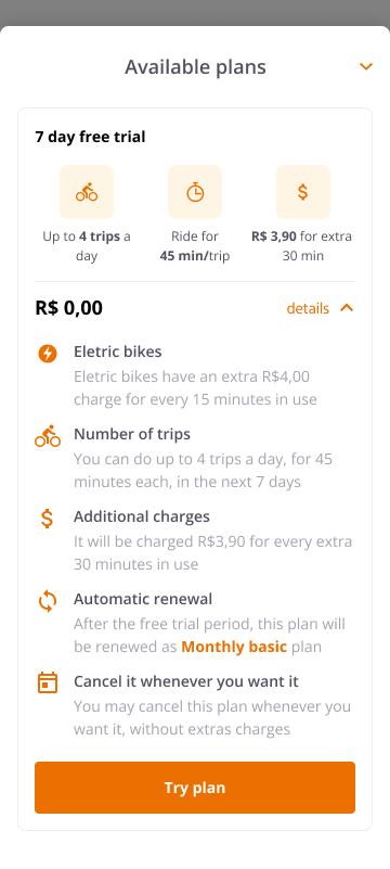
One of our hypotheses consists in reorganizing information, improving the communication and writing on our plans and categories.
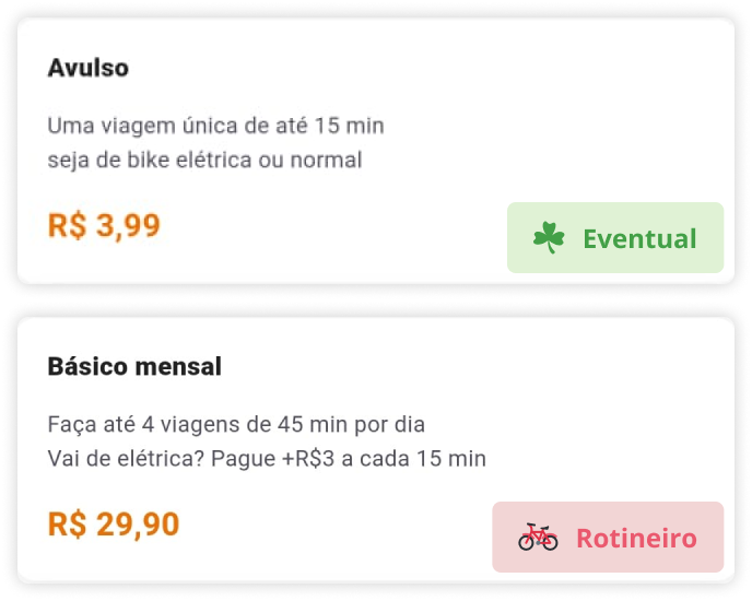
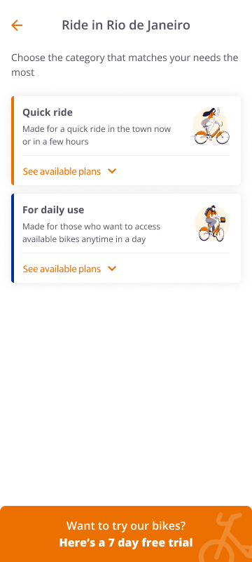
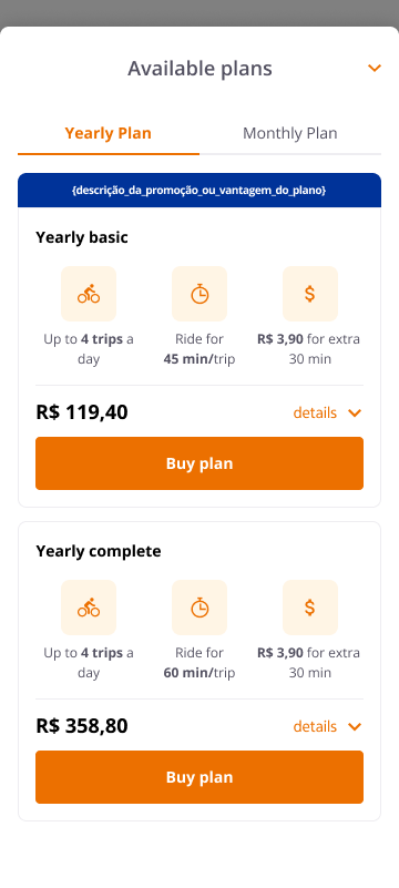
To ease the comparison between plans, we started to reorganize the ride passes per billing recurrence, instead of types of ride passes.
This is how the app used to show ride passes information
Definition
After reorganizing all the ride passes categories from 8 cities and cluster them into billing recurrences, we started to design the first proof of concept.
User testing
We recruited 7 daily customers to test our prototype.
We asked our users to perform some tasks, that would demand them to read plan details and compare some available ride passes.
Usability testing insights
- Users could easily find out if they can cancel a plan or if the plan has auto renewal
- Customers usually don't know how much cost usage fees are. To avoid charges, they try to ride always keeping in mind the ride limit time.
- Daily customers didn't know that Professional Ride Pass was related to Delivery plans.
- Users also said that this new layout could help them to compare informations.
- They didn’t understand why Free Trial was inside “Eventual” category. When they subscribed for 7 days, they didn't know about the auto renewal for the monthly ride pass.
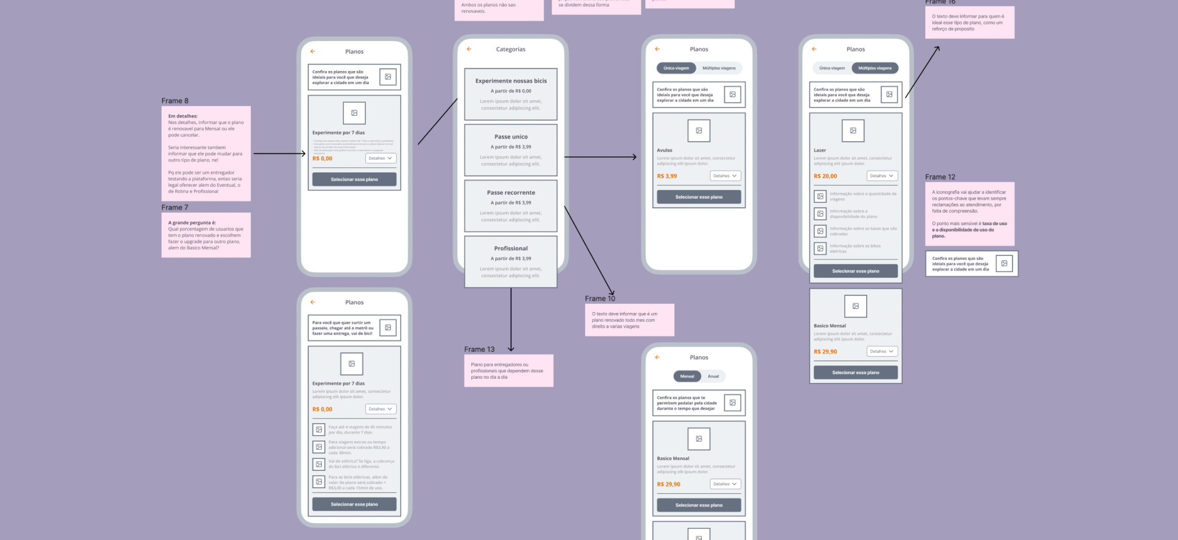
Solution
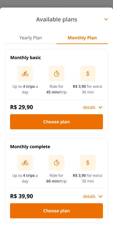
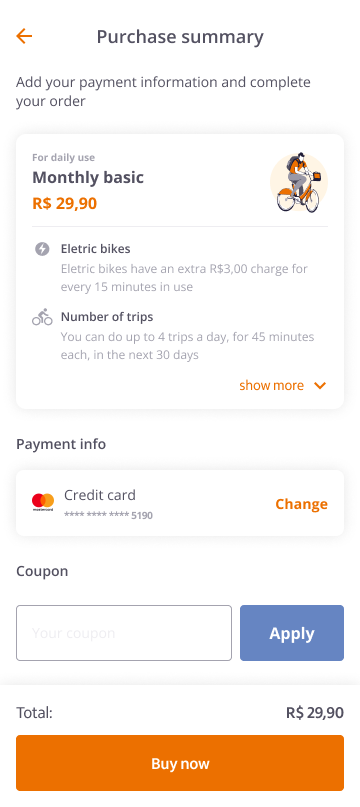
After reviewing the feedback from our usability tests, we identified areas where information was either missing or unclear to our clients. Following the design critique with the design and UX writing teams, we refined our approach and created a final prototype that addresses these issues. This new version is scalable enough for any new ride passes that we might want to add to the purchase flow.
Check out the updated screens below:
Outcomes
After delivering the final prototype, we seamlessly handed the project over to the development team and provided them with detailed documentation on each component. We also developed UX writing guidelines to assist with future updates. To improve the user experience, we clarified the information by hiding the professional plans because this ride pass is intended solely for delivery.
Check the Figma file

password: yohana25


Back
Contact me
Client
Tembici
Industry
Mobility
Year
2022
Tembici is a bike sharing platform, which allows users to avoid traffic of big cities, practice activities and enjoy an ecofriendly transport . As the product designer responsible for the project, I partnered with Tembici to understand the gaps through the Purchase flow, and designed a new solution based in interviews and usability tests.
Context
Tembici is a micro-mobility startup, that offers the opportunity to rent bikes with different purchase plans. Now, Tembici operates in 14 cities. That means they have a lot of different ride passes for different locations, because of local contracts. These deals bring some kind of complexity to the plans.
We observed that the number of tickets related to Ride Pass Information on the HelpCenter increased a lot, leading to low NPS rates.
Problem
We observed that we had 3 main problems to solve:
- Customers get frustrated and ask for a refund on Help Center;
- Difficulty to understand how the ride pass works;
- Not enough information about how fees are charged;
Our goal
Redesign the purchase process and improve the presentation of ride passes on checkout.
Methodology
As a methodology, I adopted the Double Diamond method, a framework that helps the product and design team to understand the problem core and deliver a user centric solution, with proper validations.
Research
We invited 7 analysts from Customer Support Department to join a workshop discovery. The analysts had full context of our user needs, so, their participation in the problem framming would be a starting point in the discovery process.
In the Problem Framming workshop, we discussed the following topics:
- User pains about ride passes;
- Usage fee and other charges;
- Main doubts about plan’s information;
- Reports about categories.
Relevant insights
- Customers don't know if a plan has auto renewal or not
- Users don't understand why they are charged, because the fee information is not accessible on app.
- Customers have lack of understanding about rules of ride passes because this information is not accessible
- Customers get frustrated because they are charged if they don’t return the bike to the station.
- Some ride passes were duplicated through categories, so we need to reorganize that information.
- Sometimes users aren’t able to unlock a bike and are charged for that.
How Might We
In this workshop, we could discuss some opportunities for this purchase journey challenge.
Highlight points of discussion:
- How might we make ease the comparison between ride passes?
- How might we make rules clearer for our users?
- How might we show in an effective way the reason we are charging the user?
Effort Priorization Matrix
Along with the dev team, we categorized which initiatives (discussed in the HMW workshop) would bring us quick wins. Based on this matrix, we prioritized in the sprint the suggestions next to the green board.
Hypothesis
One of our hypotheses consists in reorganizing information, improving the communication and writing on our plans and categories.
To ease the comparison between plans, we started to reorganize the ride passes per billing recurrence, instead of types of ride passes.
This is how the app used to show ride passes information
Definition
After reorganizing all the ride passes categories from 8 cities and cluster them into billing recurrences, we started to design the first proof of concept.
User testing
We recruited 7 daily customers to test our prototype.
We asked our users to perform some tasks, that would demand them to read plan details and compare some available ride passes.
Usability testing insights
- Users could easily find out if they can cancel a plan or if the plan has auto renewal
- Customers usually don't know how much cost usage fees are. To avoid charges, they try to ride always keeping in mind the ride limit time.
- Daily customers didn't know that Professional Ride Pass was related to Delivery plans.
- Users also said that this new layout could help them to compare informations.
- They didn’t understand why Free Trial was inside “Eventual” category. When they subscribed for 7 days, they didn't know about the auto renewal for the monthly ride pass.
Solution
After reviewing the feedback from our usability tests, we identified areas where information was either missing or unclear to our clients. Following the design critique with the design and UX writing teams, we refined our approach and created a final prototype that addresses these issues. This new version is scalable enough for any new ride passes that we might want to add to the purchase flow.
Check out the updated screens below:
Outcomes
After delivering the final prototype, we seamlessly handed the project over to the development team and provided them with detailed documentation on each component. We also developed UX writing guidelines to assist with future updates. To improve the user experience, we clarified the information by hiding the professional plans because this ride pass is intended solely for delivery.
Check the Figma file
password: yohana25